 Talk to sales
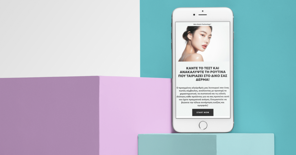
Responsive Design
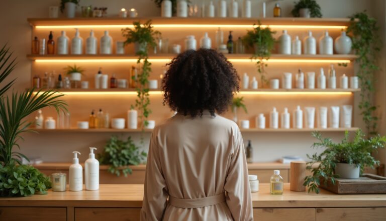
Responsive Design is a web design approach that makes your online store automatically adjust its layout and content to fit different screen sizes and devices. Whether customers browse on a phone, tablet, or desktop, responsive design ensures the site looks great and functions smoothly. This improves usability, keeps visitors engaged, and helps increase sales by providing a consistent shopping experience everywhere.
For beauty brands, responsive design is critical because shoppers frequently switch between devices — discovering products on Instagram via mobile, researching ingredients on a tablet, and completing purchases on a desktop — and a consistent experience across all screens builds trust and reduces cart abandonment.